Pantone picked two Colours of the Year for 2021 – brands from Shanghai Tang and Kelly Hoppen to Ikea and H&M have already put Ultimate Grey to work, but Illuminating yellow is a trickier sell
- The Pantone Color Institute usually chooses one colour a year, but for 2021 it wanted to express thoughtfulness and also optimism for the future
- The choice of colour traditionally influences fashion and design, but is getting more noticed by consumers too
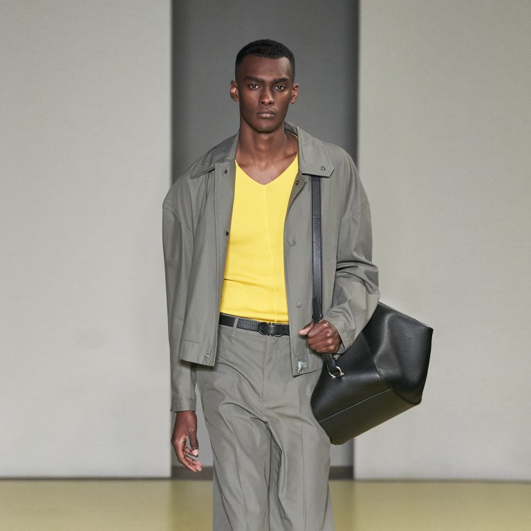
After the colourless year that was 2020, it might seem fair that the trendsetting Pantone Color Institute greedily broke with its own tradition by greedily choosing two colours of the year for 2021: 17-5104 Ultimate Grey and 13-0647 Illuminating, a vivid shade of yellow.
While millions around the world are mired in reflection, hoping the light at the end of the tunnel is real, Pantone picked colours it describes as “conjoining deeper feelings of thoughtfulness with the optimistic promise of a sunshine-filled day”.

“The union of an enduring Ultimate Gray with the vibrant yellow Illuminating expresses a message of positivity supported by fortitude,” said Leatrice Eiseman, executive director of the Pantone Color Institute, in a December statement.
The institute sets colour language standards, provides digital solutions, highlights seasonal runway colours for the creative and fashion industries worldwide, and advises companies on colour for product and brand visual identity. For the last 22 years, the Colour of the Year has influenced fashion, interior and industrial design. But it’s only recently it has become a consumer touchstone worthy of broad media coverage.
“From a fashion designer’s perspective, colour not only represents something appearing on a garment. Each colour has a much deeper meaning behind it that may be influenced by politics, society, technology and economics,” begins Ho Tak, fashion archivist at the Hong Kong Design Institute’s Fashion Archive. “It really does provide an overview of what is happening right now around the world for people to pay attention to.”
The Colour of the Year may be relatively new to consumers, but designers and anyone shilling a product have been paying attention all along. As colour plays a huge role in design and in life – Pantone’s choices draw from psychology, trend analysis, and arts and culture among other influences – founder and managing director of The Good Studio Limited, Kaye Dong, looks forward to the news. Echoing Ho, “For us, it’s about much more than the colour itself, but about the reason why it was selected,” she says.
“The Pantone Colour of the Year – or in this year’s case, colours – always offers wisdom; a reflection of the current times we are experiencing and an insight into the future.” As Dong sees it, grey and yellow are distinct yet complementary, and represent unity and support. “Grey is adaptable and dependable, and yellow is joyful and vivacious. These colours together offer hope and strength.”