Why beige is making way for bold: it’s all about Instagrammable interiors for Gen Z, as the neutral tones preferred by Kim Kardashian and Kanye West are being phased out for more vibrant decor themes

- Minimalist tones are so yesterday – 2024’s interior design vibe is all about energy, as we ditch the earthy tones of the post-pandemic era for more dramatic hues
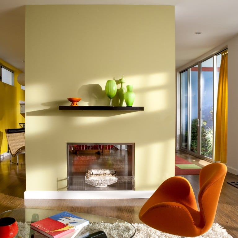
- India Mahdavi, interior designer for hip restaurant Sketch London, singles out pink and yellow as colours to watch, which she describes as soothing and comfortable
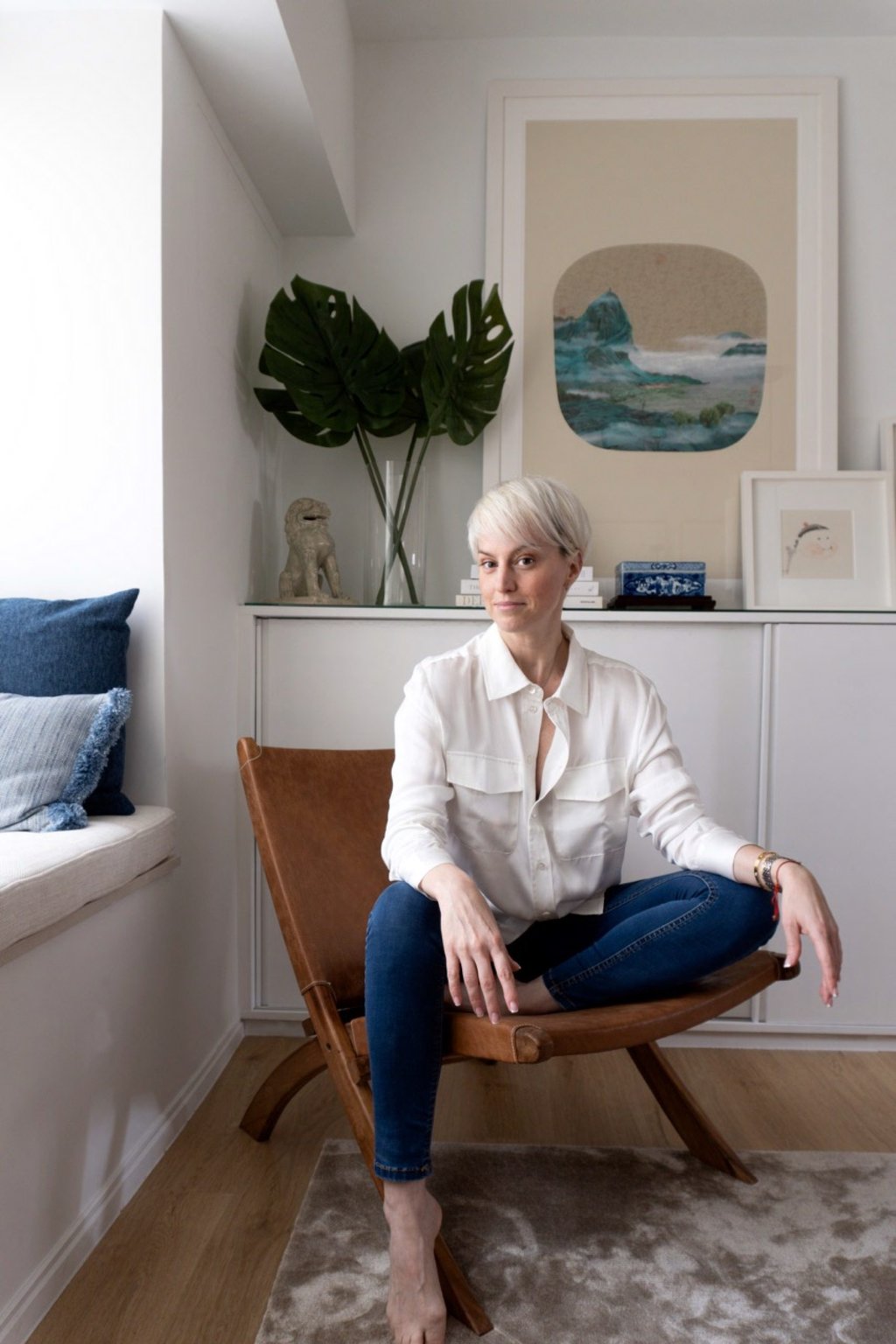
“The narrative for 2024 is all about energy, vibrancy and life. Neutral tones were all about calm and simplicity, then we moved into earthy tones to connect to the natural environment after the intensity of the Covid years,” explains Emma Maclean, founder of Hong Kong-based interior design studio EM Bespoke.
“Now life is being injected into these earth tones and these colours are evolving into dramatic yet warm, vibrant shades we can easily embrace into our spaces,” she says.

This move into colour is a natural evolution, especially for the younger generation who are spending more time in their homes and looking for more photogenic spaces to post on Instagram. While neutral colours are still viewed as safe, if formulaic, bolder hues are being embraced as a fun and easy way to express one’s personality and style, especially in private living spaces.
“Having a colourful interior plays an important role in awakening our senses – surrounding yourself with colours, light and textures is a way of keeping them alive,” says “queen of colour” India Mahdavi, the interior designer behind hip restaurants like Sketch London, among many others.
As with the fashion industry, there are certain colours that trend each year. Mahdavi singles out pink, which she describes as soothing and comfortable, and yellow, which attracts light. Maclean highlights cheerful, vitamin-inspired hues like orange, yellow and apricot, or energising tones such as red and blue.

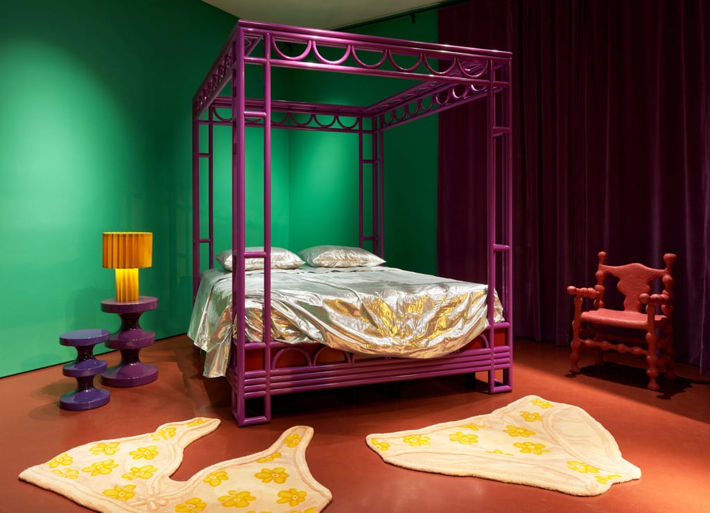
“Green is also having a moment. All around the globe, people are becoming more mindful of the natural world and we associate green with nature,” adds Bryony Sheridan, buying director at Abask, an online shopping destination for home interiors and collectible design.
“As a continuation of that, it’s a colour that evokes feelings of wellness, health and vitality, which are wholesome sentiments to surround oneself with through colour,” she says.
One of the biggest benefits of working with colour is that the options are endless – currently Pantone offers over 2,000 different shades to choose from, and certain suppliers and brands such as paint specialists Farrow & Ball offer customised shades. Personal preference and style are a major deciding factor when it comes to choosing the right palette for your home, but there are some other easy guidelines to follow for the uninitiated.