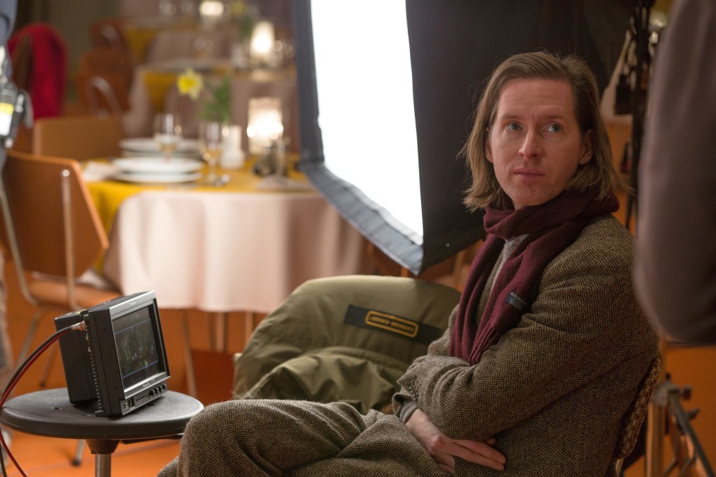
How The Grand Budapest Hotel inspired this Hong Kong design studio to think about narratives and nostalgia
Director Wes Anderson’s ‘films are similar to the way we storyboard our ideas to present them to clients’, say the co-founders of architecture and interior design studio Bean Buro

Comedy-drama The Grand Budapest Hotel (2014), directed by Wes Anderson in his trademark ravishing visual style, and starring an ensemble cast led by Ralph Fiennes, tells the story of a hotel concierge in a fictional Eastern European country, as he tries to prove he is innocent of murder against a backdrop of impending fascism. Lorene Faure and Kenny Kinugasa-Tsui, co-founders of Hong Kong architecture and interior design studio Bean Buro, explain how it changed their lives.

Kenny Kinugasa-Tsui: “We’ve been Wes Anderson fans since The Life Aquatic (2004). I remember very clearly that The Grand Budapest Hotel lived up to my expectations of a Wes Anderson film. In fact, it was a huge improvement. It was even more sophisticated in terms of the way he created all these beautiful sets; I loved the way the hotel forms the backdrop for all these different scenes. The camera treatment became even more creative.
“But the reason we love the film isn’t only because of the design of the hotel. It does have really nice design, but it goes deeper than that. It’s how, as a filmmaker, he can tell such powerful stories through the way he puts it together. It’s something we aspire to as designers.”
Lorene Faure: “What attracts us to his films is: our name is Bean, which stands for ‘between exchanges of architectural narratives’, and ‘narrative’ is a key word for us. We start a project with a narrative – telling the story of the client to create places that resonate with the occupants.”

KKT: “His films are similar to the way we storyboard our ideas to present them to clients. We break it down into fragments, much like storyboarding a film. These are like different scenes in our stories. It directly inspires the way we do client presentations.”
LF: “In a way, we also make films. The way we present our ideas is through animation, and the way we do it is quite poetic. Nowadays, social media being what it is, there’s a lot more demand for videos of spaces. We celebrate key moments with videos. The way we do it is very much inspired by Wes Anderson – the way he uses the camera.”
KKT: “His work is also a good reference for us. We sometimes screen his films. We have a big screen and we encourage our guys to watch them. We have a studio of about 20 people and we love talking about his sets.”

LF: “Something really fun about being an architect and interior designer is the way we work is a lot about how you structure a space. Wes Anderson always allows the viewer to understand the set, but the set doesn’t make sense in real life. You’re always thinking, ‘It’s a bit of a puzzle.’ We just love the amount of thought that has been put into the sets.