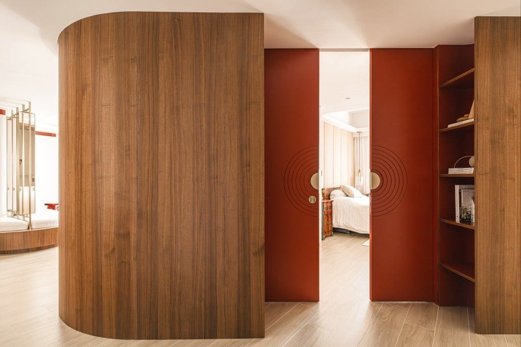
How this huge Hong Kong flat received a fully rounded revamp – with curved walls, arched furniture and wavy columns
Confronted with a highly unconventional design concept for their 2,400 sq ft apartment, a couple opted to go with the undulating flow

Straight lines and right angles dominate in most homes so when designers Christina Standaloft and Jay Jordan, founders of design studio Craft of Both, presented their curvilinear concept to their clients Mayra and Praf Ellis, they expected a degree of resistance.
“The design concept represented a departure from the original apartment’s angular lines and the creation of a more sensory experience through softly curving walls and rounded furniture and motifs,” says Jordan, who, along with Standaloft, grew up in Hong Kong. “It is a bold, contemporary arrangement and from the outset we knew how challenging it might be for [our clients].”
Thanks to an instant rapport with the designers and an open mindset, the Ellises loved the idea. The Honduran-Thai couple had bought the 2,400 sq ft property in Pok Fu Lam in 2022, with an existing tenant lease, so had never lived there themselves. Craft of Both used the time before the rental term expired for meticulous planning and started the six-month renovation in March last year.
“Although we have lived in Pok Fu Lam for 22 years, this is the first home we have purchased together so we were very new to the design process,” says Mayra. “We really appreciated the considerable time Jay and Christina spent on the plans and on listening to us. The original rendering looks almost exactly like the final apartment because everything worked and there was no need to make changes.”
Although the flat had a lot of odd corners, the designers embraced its quirky orientation to use every inch of space. They rounded walls to make more organic, aesthetically shaped spaces and thought long and hard about the tactility of wall treatments and finishes so as to impart a sense of fluidity and calm to the home.
Their biggest challenge was a long, dark and narrow corridor. Standaloft and Jordan decided to break it up to promote a greater flow of light and space and give the bedrooms a more symbiotic relationship. Rather than regular walls between rooms, they created undulating, almost wave-like columns, clad with giant wooden fluting finished in white lacquer paint. Offering a highly sculptural visual, this feature disguises structural columns as well as hiding a sizeable amount of storage space, which was one of the clients’ priorities.
