A Hong Kong family flat gets a sleek redesign with a New York state of mind
How a Mid-Levels West apartment got the modern renovation recognition it deserved when its 3 adult occupants opted to go big with their home decor

A true family home in every sense of the word, this Mid-Levels West high-rise has served the multigenerational Chan/Tong household for more than two decades.
Over various stages since it was bought new in 2002, the 1,830 sq ft apartment has comfortably accommodated two parents, a grandparent, two children and a live-in helper. Now, it’s just Lily Tong, husband Leo Chan, daughter Janice and Biggie, the French bulldog. By mid-2022, it was time for a first-ever major renovation.
Realising their clients were “open to bold suggestions”, Chen says, the designers set to work.
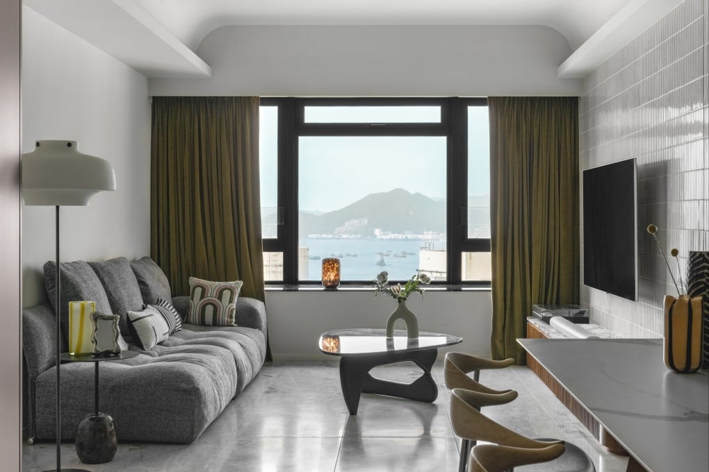
With only two bedrooms needed, the layout offered scope for a generous reconfiguration of what was originally four bedrooms and three family bathrooms plus a helper’s room with a fourth bathroom. Before they got to that, however, an odd triangular corner of the living room – problematic for furniture placement – had to be sorted. A solution was to realign the offending wall to form a more useful rectangular living room, allowing the carved-out corner to become a storage room accessed from behind.

