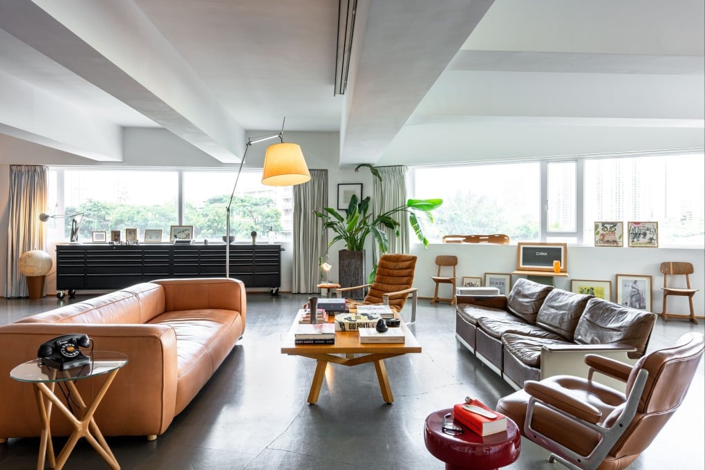
Vintage finds blend with industrial chic in this interior architect’s Hong Kong loft
- Interior architect Sean Dix, a mid-century industrial enthusiast, finds and restores vintage functional designs whose raw beauty inspires him daily

An elegant, if somewhat strange-looking piece of wood lies on a windowsill in interior architect Sean Dix’s 4,000 sq ft space in Wong Chuk Hang. A blade from a vintage ceiling fan? Guess again. It is in fact a leg splint, designed by Charles and Ray Eames for wounded sailors in World War II and made from what was back then experimental moulded plywood. It also characterises the style of Dix’s Southside unit – quirky, unexpectedly beautiful and filled with curios that have fascinating backstories.
“I am a total materialist – I love stuff,” says Dix, the founder of dix design+architecture. “I like finding and conserving all sorts of things and the furniture, objects and artwork I have here are an accumulation of everything I’ve collected over the years.”

On the lookout for a second showroom/office in Hong Kong, he settled on this loft, where little had to be changed. That included a large kitchen at one end of the main space – Dix loves to cook and entertain clients – and all the fittings down to the coffee machine and grinder.
Similarly, the spacious main bathroom, which features marble tiles and granite slabs, suited his aesthetics, as did the white walls and grey epoxy flooring.

“My most important intervention was the lighting,” he says. “In some areas, the former tenants had fitted glaring, hospital-room-white lights; elsewhere there were whole expanses of nothing. It was horrific.” Out went the overhead fluorescent tubing and in came warmer light sources, placed in various areas at different levels including within plant pots. Dix also installed hidden LED strips to backlight his vintage rosewood shelving unit by Poul Cadovius, a work of art in itself, which features an impressive collection of books and curios found everywhere from antiques shops to flea markets to online stores.