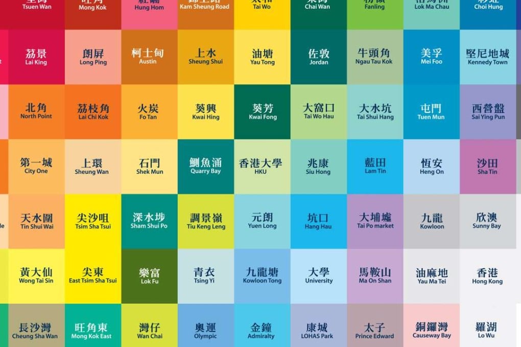
Why every Hong Kong MTR station is a different colour – the reason may surprise you
When Hong Kong’s mass transit railway lines were being built, it was decided the stations should be colourful to beautify them, and different colours were chosen to help travellers who couldn’t read identify them

Mong Kok is red, Admiralty is blue, and no one passing through Choi Hung MTR station can fail to spot the rainbow-streaked pillars at the platform. You may think the vibrantly coloured tiled walls of Hong Kong’s mass transit railway system mirror the city’s energy, but that’s not why contrasting colours were chosen for its stations.
The main reason bright colours were adopted when the first line opened in the 1970s was to lighten up the subway system, according to Andrew Mead, the MTR Corporation’s chief architect. With no windows or natural light, underground platforms can be gloomy. Bright colours are associated with beauty, and they bring a dash of that to the mostly subterranean stations, he says.
The corporation could have chosen a neutral white design. But Mead says an important factor in picking different colours was function. Underground, where there are no landmarks to look out for like when you’re travelling by bus or car, colour helped differentiate the MTR stations, and gave each their own identity. That was important, Mead says, because “back in the 1970s, there was still a high level of illiteracy” in the city. It was not until 1971 that Hong Kong launched a programme of free compulsory education.
Watch: Meet the lady behind Hong Kong MTR announcements
