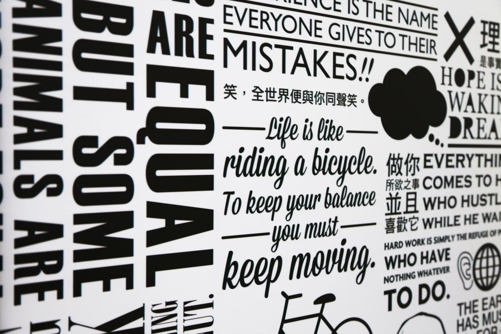
Hong Kong exhibition celebrates the history of typography
Tsim Sha Tsui exhibition looks at the art of arranging and printing type

Don't know your Helvetica from your Baskerville? How about your Times New Roman from your Daytona? Your Rockwell from your Gill Sans? Still blank? Don't worry, you're far from alone.
Although much of the world, on its screens and billboards and in its books and magazines, is a blaze of typefaces often twisted and teased in the service of product or programme, more often than not we don't know what we're looking at - not in a typographical sense anyway.
Typography, the art of arranging and printing type, is celebrated as part of this year's Design Month at K11 Design Store, Tsim Sha Tsui. An exhibition, "The Origins of the Sources", focuses on the Lanston Monotype Company, founded in Philadelphia in 1887. Monotype patented the original hot-metal typesetting machine used in printing, but the company's influence goes far beyond hardware.
Distinguished by arguably the world's best-known font, Times New Roman (commissioned in 1931 by newspaper), its catalogue runs to more than 2,000 original and revived typefaces, including Helvetica and friends. More than 10 per cent of those are non-Latin typefaces - and it was as long ago as 1920 when Monotype created its first Chinese script.
The ultimate goal of a good typeface is to be transparent and to transmit the content it carries. I like it when people know something about fonts, that's wonderful; but we prefer other designers to know the names
In 2006, Monotype Hong Kong came into being with the acquisition and renaming of the local typeface design and production company, China Type Design. And with a seemingly never-ending demand for new fonts, the company finds itself under pressure to respond rapidly to every commission.
