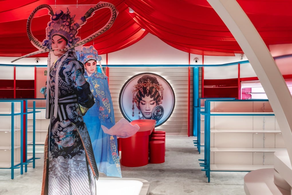
How a new Hong Kong snack shop’s design reflects Cantonese opera’s energy and deep roots
- The Natural is Best flagship shop at the West Kowloon Cultural District’s Xiqu Centre aims to capture the excitement and anticipation of an opera performance
- Colours and lighting reflect Cantonese opera’s theatrical atmosphere, while spatial features are influenced by traditional Chinese design

You might recognise Natural is Best from the snack chain’s countless outlets in malls and MTR subway stations around Hong Kong.
Then again, you might not – many of them fade into the background of the retail landscape. But not the company’s new flagship store, which opened in late August in the basement of the Xiqu Centre, in the West Kowloon Cultural District.
Inspired by the building’s vocation as a home to Chinese opera, Natural is Best hired Hong Kong architecture and interior design studio Metagram to come up with a design concept that reflects the art form’s distinct energy and deep roots.
“They knew we approach projects in an architectural kind of way, so rather than having a specific style, we realise projects according to concepts,” says Metagram director John Chow.

What struck Chow and his team was the store’s irregular space, with a narrow front section leading to a wider room at the back.
