Off Centre | Tokyo’s Olympic organisers are smarter than the PR hustlers think
Controversy over plagiarism of 2020 Olympics logo is merely a storm in a teacup

You have probably noticed that there is something of a backlash underway against the free movement of money. In America and Europe, even people who were for it have looked at how the wind’s blowing and are suddenly against it. Borders and barriers and sounding like you’ve read a Noam Chomsky book are in vogue. Free trade is being spoken of in tones usually reserved by conspiracy theorists for the Jesuits or the Bilderberg Group.
Some aspects of globalisation are likely invulnerable, though. However far the nations of the world opt to go in protecting their own industries against foreign encroachment, or in turning the screws on capital flows, the universal triumph of branding seems a fait accompli.

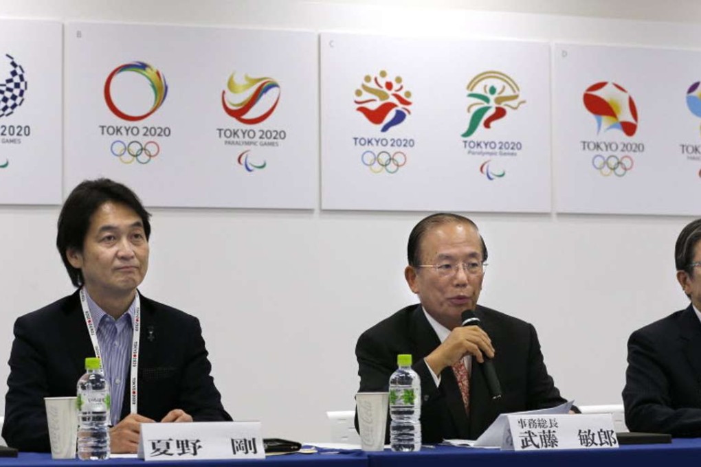
That is why when the PR and marketing monkeys mess up, it becomes news. On the face of it, this is what has happened with the Tokyo Olympic Games over the last year. First the British architect Zaha Hadid’s winning design for a new stadium for 2020 was thrown over due to exorbitant costs and another bid hastily selected. Then along came a plagiarism controversy over the logo. I am not so sure, though: I think perhaps the Japanese organisers are smarter than all the PR hustlers competing for their largesse give them credit for.
The original winning proposal for the Games emblem, by Kenjiro Sano, was withdrawn late last year. A theatre in the Belgian city of Liege had said it must have been copied from their own logotype and threatened to sue. Sano’s design, an assortment of shapes arranged to form a “T”, certainly looked like something you had seen before. Quite possibly a “T”. At any rate, it hardly rivalled Caravaggio in its originality.

