The View | Don’t blame globalisation for stagnant wages in rich countries

Globalisation, since the collapse of the Berlin Wall, has had both supporters and detractors.
Supporters credit it with bringing unprecedented prosperity to many parts of the world in the last quarter of a century and lifting 650 million people out of poverty. Detractors blame it for the slow income growth afflicting low- and middle-class workers in rich countries.
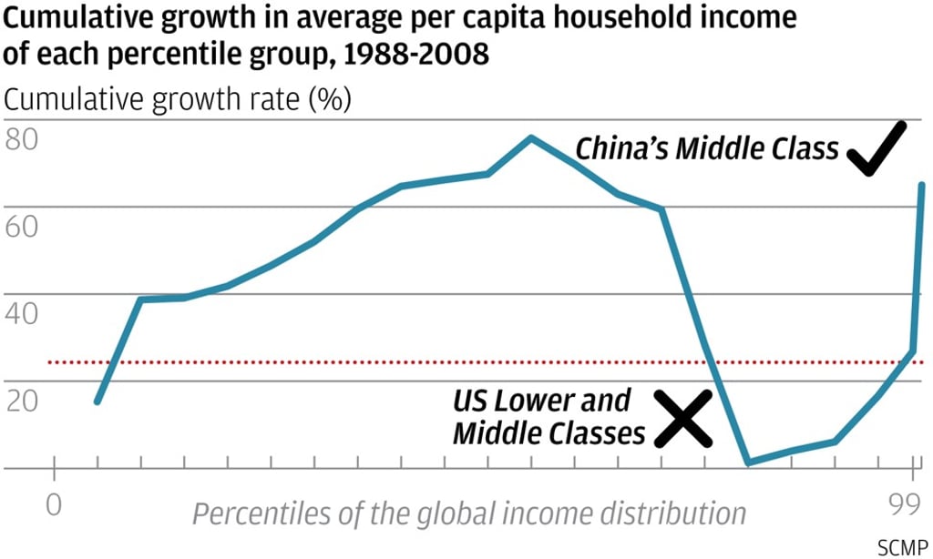
Within economic policy circles, a graphic illustration nicknamed the “elephant chart” produced by former World Bank economist Branko Milanovic seems to offer dramatic proof of what opponents of globalisation have claimed (see chart).

The tip of the elephant’s trunk, at the far right, shows that the world’s super-rich – mostly from the mature countries – are much wealthier than in the past. The tail at the far left shows that the world’s poorest – mostly from Africa – are only slightly better off than they used to be.
It is hard to imagine how free trade and investment flows could have led to the stagnation of living standards for the bulk of people in rich countries
The dip around the base of the trunk is perceived as showing that the incomes of the lower and middle classes in advanced countries, including the United States, have stagnated.
